Context Research
Neville Brody Analysis
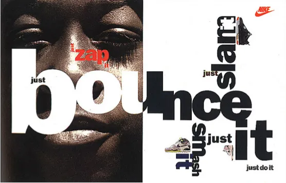
Brand Strategy for Nike, Neville Brody, 1988
“Brody’s 1988 Nike advertisement “Just Bounce It”, (Clifton 2013), practiced new forms and methods of experimental typography, incorporating image with dramatically varied scales of lettering. (Image below) This new typographic approach invigorated the audience to develop into active viewers. By presenting a new technique within a popular context such as Nike, Brody challenged design conventions for an entire generation of artists and the general public. He encouraged them to reject the conventions of traditional typography and accept a new form of experimental type and image making. Furthermore, Brody explored notions of Punk culture through this new typographic approach. He stated “Is not our role as designers one of social influence and opinion? We wield such power, seize every opportunity given to you” (Linda 2013) supporting the idea that any powerful design can influence at a large scale.”
Claire Merchant, Artist, Blogger, September 9th, 2014
https://clairemarchant23.wordpress.com/2014/09/09/neville-brody-typography-critical- analysis/
I agree with Claire Merchants comments regarding Brody’s encouragement of rejecting the conventions of traditional typography, and it shows through this poster. The type used in this poster is very experimental and creative. It is placed both vertically and horizontally, layered among imagery and is raised higher at certain points. I believe this poster to be very successful as it is clever, brave and at the time was unconventional

Free Me From Freedom Poster, Neville Brody, 2008
“At first glance, the artist work clearly makes great use of typography, color and type as image. He seems to be very sufficient at filling up a page with type while balancing scale and weight. In “Free Me From Freedom” the words are stacked, one on top of another. The weight of the letters is uniform and the background is black. What makes this poster interesting is the use of color within the letters. In my opinion, the use of color combined with the type itself makes the poster more dynamic and aesthetically pleasing, while fulfilling its purpose. Also, the use of a black background simplifies the poster, keeping it from being too visually noisy.”
Tyhaa Mutalib, October 10th 2013
http://thetyhaland.blogspot.co.uk/2013/10/critical-analysis-in-humanities-visual.html
Tyhaa Mutalib’s comments on Brody’s Free Me From Freedom poster, are all precise and agreeable. I personally find the colours themselves are the stand out point, after you see them, you take notice of the type they are set within. The dark background only adds to the contrast. I particularly enjoy the creatively shaped lettering and how the type is laid out, one word on top of the other. I think this composition works brilliantly and has great visual impact


Cabaret Voltaire — Micro-Phonies album cover, Neville Brody, 1984
,“The album Micro-Phonies by Cabaret Voltaire was art directed by graphic design heavyweight Neville Brody in 1984. Brody’s infamous typography features on the front and a bandaged figure spouting liquid from the mouth stares blankly at the viewer. Being heavily influenced by the punk movement, his design seems to fit the Dada-inspired and punk-thriving band’s sound and vision.”
underthemusiccovers, August 25th, 2014
https://underthemusiccovers.wordpress.com/2014/08/25/cabaret-voltaire-micro- phonies-neville-brody-1984/
I agree with the comments made about the punk movement being apparent in the album cover, and can completely agree with them. Brody was heavily inspired by the punk movement in his earlier years and this shows within this work. The photography used is dark and rather unsettling, the red crosses placed over the imagery adds to this effect. The colour scheme is very visually pleasing, the light teal is complimented well by the red and grey, and suits the punk inspired band very well. The typography used for the band name is stylistic and suited to their style very well


Oceans 11 and 12 posters, Neville Brody, 2001, 2004
“Above are the movie poster’s Brody did for Oceans 11 and 12. Both posters are unified by the colors and styles of the almost silhouette figures. They have an epic yet sleek feel to them. The use of just shades of black, white and red was very effective in creating a style to fit the movies.”
Jikcreationsr, April 24th 2012
https://jikdesigns.wordpress.com/2012/04/24/neville-brody/
“The Oceans Eleven and Twelve film posters use a typeface designed by Neville Brody, the posters are extremely similar compared with the Oceans Thirteen poster. The colour scheme of the three colours black, white and red work very well together. Red is a very emotionally intense colour, it signifies fire and blood, so it is associated with energy, war, danger, strength, power, determination as well as passion, desire, and love. Black is a mysterious color associated with fear and the unknown. It usually has a negative connotation, it is associated with death, evil, and mystery. As opposed to black, white usually has a positive connotation. It is associated with goodness, innocence and purity. The two posters use different views, for example the Oceans Twelve poster uses a birds-eye view. They both use a hierarchy to show the actors names. It has been designed using a grid structure. I really like the style Brody has used to produce these posters. They appeal to the audience and are eye-catching from the use Brody’s large font.”
02TW4160 Blog, January 21st, 2010
https://02tw4160.wordpress.com/category/neville-brody/
Both authors make valid points regarding the colour schemes, layouts and deeper meanings of the posters. I particularly enjoy the viewpoint of both posters as it allows a different perspective to be seen. They also allow for more experimental typography and imagery, which have been integrated together The typography is visually striking due to the size colour and style of it

Graphic Arts poster, Neville Brody, 1992
“This poster is interesting as the typography is unusual being that many of the letters are overlapping, but the colours show through each other, like coloured tissue paper layered on top of each other.
However, it was probably created using computer technology as the background has been blurred to accentuate the foreground writing.
Although, the colours are eye-catching, I think it may be too difficult to understand the text as, because it’s a poster, it’s important that it can be understood at a glance, which I don’t think this achieves.”
Claire Merchant, Artist, Blogger, September 9th, 2014
https://clairemarchant23.wordpress.com/2014/09/09/neville-brody-typography-critical- analysis/
Claire Merchants comments of Brody’s Graphics Arts poster are very fair. I agree that the poster can come across as confusing and hard to understand as there are many colours and shapes involved in the foreground which aren’t entirely legible. The blurred background only adds to the existing imagery and adds another level of graphics to incorporate and contend.

23 Skidoo, Just Like Everybody, B.C Records, Album Cover, Neville Brody, 1987
“This was a compilation of 23 Skidoos best recordings. The cover had to be cost-conscious and commercially striking, so I tried to give it the feeling of a colourful “bootleg”. The type is powerful and confident- like an American football players shirt; its positive, physical force is made even stronger by the exploding sun. All the artwork was prepared on a photocopier.”
Neville Brody, B.C Records, 1987
Jon wozencroft, 1997, The Graphic Language of Neville Brody, Colour Edition ,Published in Italy, Thames and Hudson pg 87
Image taken from -http://ltmrecordings.com/just_like_everybody_ltmcd2532.html
The above comments on Neville Brody's album cover design for 23 Skidoo are all valid and fair, especially regarding the type. The typography is bold and eye catching and also seems stretched, which is different and unusual. I also agree that the cover is reminiscent of a bootleg, and appears almost rebellious in design, especially in the context of graphic design in that time period.

Cover for The Kinks (The official biography) Designed by Neville Brody, Published by Faber and Faber, 1984
“The Kinks was a history of the group written by Jon Savage. Most of the photos were in black and white, with duotone reproductions used for many of the photographs in order to create a sense or re-presentation, as if something had altered over the years. There was quite a cluster of music books published around that time, so I wanted to give The Kinks a certain quality that combined pop with classicism. We used a lot of white space, but reversed type out of bars for the page numbers to hold the text. The cover design itself seems a bit naive to me now, perhaps accidentally in keeping with the groups own history. Where have all the good times gone?”
Jon wozencroft, 1997, The Graphic Language of Neville Brody, Colour Edition ,Published in Italy, Thames and Hudson pg 88
Image taken from- https://www.amazon.co.uk/Kinks-Official-Biography-Jon-Savage/dp/0571133797
Neville Brodys comments on his work seem thought out and concise. It would seem Brody wanted to be experimental with this design but also pay homage to the Kinks and their history, while doing so he created a strikingly visual cover which was both minimal and memorable. It does however come across rather uninspiring, which Brody himself noticed looking back on it.

New Order Cover, The Face, no.39, July 1983
“It was thought that new order were not recognisable enough to the general public to act as cover stars, so a different approach was needed. Brody therefore gave the photo of New Orders Stephen Morris a radical crop, emphasis. This break with convention was subsequently chosen as Cover of they Year in the 1983 Magazine Publishing Awards”
Jon wozencroft, 1997, The Graphic Language of Neville Brody, Colour Edition ,Published in Italy, Thames and Hudson pg 105
Image taken from - http://www.designcurial.com/news/ahead-of-the-curve/
This cover is a perfect example of why Neville Brody gained so much attention as the art director of Face Magazine. His unique approach to photography and composition as well as typography, can clearly be seen throughout this striking cover. The large bold type set on the extreme close up image is both bold and eye catching. The fact that this cover was chosen as cover of the year only proves the point that Brody is innovative and brave when it comes to his designs.

Holidays In Hell, The Face, no.53, September 1984
“A right hand page opener that clearly shows the hallmarks of Brodys design. The symbol at the head of the page relates to a code on a film pack (the rays of the enclosed sun were in fact cutting blades) A curved edge to its border creates a downward movement to the text information. The reversed out E of the headline hints at what Brody describes as the hidden world behind typography, where a roman letterform is made to seem an italic. The directional bullet is exaggerated in size to announce its change from the triangle used hitherto”
Quote and Image-
Jon wozencroft, 1997, The Graphic Language of Neville Brody, Colour Edition ,Published in Italy, Thames and Hudson pg 114
This page opener designed by Neville Brody for face magazine shows just how invested Brody was into typeography. All elements of his design are extremely thought out and designed to the highest detail. The simple downward slant of the highest symbol pointing to the information below, to the reversed E hidden away, all aspects of the design work, and work fluently together. This truly shows that Brody was a marvel of type and graphic design as a whole.

Cover for New Socialist, No.39, June 1986
“On this cover, Brody used a colour negative image of New York to suggest a nuclear holocaust. The Bodoni type contrasts with the over Modernist logo. The white strip at the head of the page offsets the textural image and gives the magazine a clear newstand identity”
Quote and Image-
Jon wozencroft, 1997, The Graphic Language of Neville Brody, Colour Edition ,Published in Italy, Thames and Hudson pg 130
This cover for the New Socialist designed by Neville Brody is particularly effective and creative due to the main imagery he created and the typography. By using the colour negative over the skyline imagery, it creates a very believable post-apocalyptic effect. The warm toned colours of the title and subtitle almost blend into the background, making them seem as one. This contrasts greatly with the New Socialist logo. Not only because of the colours used but also the different fonts. The serif and sans serif contrast nicely and further convey the post war feel.

Interview: Neville Brody on the Changing Face of Graphic Design
Conducted by designcurial.com
“Has the role of the graphic designer been diminished or augmented over the last 40 years, now that our minds and screens — and lives — are buckling under the weight of visual clutter and unsolicited information? Few would be better placed to argue the toss than Neville Brody. In the 80s and 90s, he really was a household name — if your household liked reading the era-defining magazines he designed such as The Face, or Arena, or listening to Depeche Mode or Cabaret Voltaire whose iconic album covers he created. Over the decades, he’s been celebrated with a retrospective exhibition at the V&A, published the world’s best selling book on graphic design, developed whole new families of fonts, steered global advertising and identity campaigns for Dom Perignon, Issey Miyake and Nike, and given The Times and The Guardian the friendly, modern fonts and layouts they still wear proudly today. Which graphic designer can claim as much influence in 2013?”
Quote and image taken from - http://www.designcurial.com/news/ahead-of-the-curve/,11 November 2013
The above quotation was taken from the opening paragraph of an interview with Neville Brody. The author clearly summarises just how much of an impact Brody made on the design industry. He is a bestselling author, the pioneer of a vast number of fonts and also a major influence on the advertising and marketing world. Brody made a huge difference to the style of design apparent in publications, books, album covers and major branding, and this influence was recognised by millions of people. As the interviewer concludes with, not many designers can say they made as much of an impact as Neville Brody.

Interview with graphic designer Neville Brody
Conducted by Andy Butler for designboom.com, October 10th, 2014
designboom: when you were growing up did you always want to become a graphic designer?
neville brody: I feel like I was always going to be an artist or a designer — I was never going to be a train driver or a fireman. I was drawing before I could even walk, so the only decision I had to make really was whether I wanted to become a fine artist or a designer. the reason I entered into design is because I thought that fine art was fairly dishonest as an industry. it pretends to be about culture but it’s really about money. design is much more honest about it’s commercial context and can also reach a lot more people than fine art.
I have always been very interested in how advertising and design can manipulate the way that people think and in the early years I wanted to lean those tools in order to turn them around, to reveal the truth rather than conceal it.
something else worth mentioning is that when I was about seven or eight I designed a complete identity system for an imaginary postal service — which is quite sad when you think about it! the fact that I wanted sit at home doing that while my friends were out playing football!
Quote and image taken from -https://www.designboom.com/design/interview-with-graphic-designer-neville-brody-10-10-2014/
The above quotation was taken from a portion of an interview between Andy Butler and Neville Brody for designboom.com. In this interview Brody gives a fascinating insight into his childhood and his wishes to work in art and design as a child. His feelings towards the commercialism of design and interest in advertising from a young age, can clearly be seen and conveyed through his work. The fact that Brody is so inventive and broke boundaries no one dared to break, is one of the reasons his work can influence people into feeling the emotions he wanted them to feel when viewing his work. I think it is interesting that this has stemmed from his interests as a child and has manifested in his designs.

Professor Neville Brody
Staff profile page on The Royal College of Art website
“Neville Brody is Dean of the School of Communication and one of the most celebrated graphic designers of his generation — a leading typographer and internationally recognised art director and brand strategist. The founder of design agency Brody Associates, he established his reputation as creative director of the 1980’s Face magazine, subsequently working with record labels, magazines and a range of international clients including Apple, BBC online, The Times, Channel 4 and the England football team. His hugely influential work has been the subject of numerous exhibitions and publications, most notably the two-volume monograph The Graphic Language of Neville Brody, which was accompanied by an exhibition at the Victoria and Albert Museum.”
Quote and image taken from - https://www.rca.ac.uk/more/staff/professor-neville-brody/
Neville Brodys staff page on The Royal College of Art’s website gives a detailed account of his accomplishments, ranging from his typography work to his enviable V&A exhibition. Neville Brody is currently the Dean of the school of Communication and the title is highly deserved. Due to his extensive knowledge and brave, innovative decisions,Brody can teach his unique ways and techniques to anyone wishing to learn.

Helvetica Documentary with Gary Hustwit and Neville Brody for Lynda.com
“I use Helvetica a lot but I originally hated Helvetica. I’ve always hated Helvetica. And the badges you’re giving out, as I said, I think you should have one that says I love hating Helvetica. So. Which I think would be more appropriate. We may have to meld them. I’ve worked on The Face magazine for a number of years and there was always this expectation that we would deliver something new and radical in every, every single month. People were disappointed when it wasn’t radical. And, so in the end the newness was the culture that people were desiring.”
Quote and screenshot taken from - https://www.lynda.com/Design-Documentaries-tutorials/Neville-Brody/168234/182016-4.html
This quote was taken from the transcript of a documentary on Helvetica which featured Neville Brody, and features some great insights into the mind of Brody and how he viewed popular fonts and also consumerism. Taking this quote into account, Brody seems to come across as cynical when discussing his use of helvetica and also his consumers. He states he has always hated helvetica yet uses it anyway, and often. Brody also seems dissatisfied that people expected him to come up with exciting, radical ideas, but they no longer appreciated the design itself, instead the excitement came from the level of experimentation he used in his designs. The shock value they portrayed.
