 December
01
Tags
Baker Miller Pink
Asking around, one would be hard pressed to find an individual who’s never fielded the question, “what’s your favorite color?” Some people prefer shades of yellow reminiscent of sunshine, hues of red that evoke a feeling of power, or calming tones of blue. Though one’s favorite color is not a reliable metric for determining facts of their personalities, their color preference may indicate if they like or dislike the societal and emotional qualities associated with a color. Although they span the range of the visible light spectrum, what these colors all have in common is that society typically associates them with a concept or an emotion. In fact, you may notice color trends across several niches in our lives – social media tends to use lots of blue tones, and fast-food restaurants tend to utilize the colors red and yellow. However consistent these observations are now, it is difficult to parse which came first – the associated reaction or the widespread use. For example, red is dubbed an appetite stimulant, but there is scarcely any science to back this up. Regardless, fast food restaurants heavily utilize red in their designs. Do we now associate red as an appetitive color because it genuinely stimulates a drive for caloric intake, or because we associate it with tasty fried food? Indeed, while most color psychology is based on surveying folks to determine the feelings they associate with different hues, there have been a few outliers – the study of which are more well documented. One of such colors is a shade of pink known as Baker-Miller pink (hex #ff91af). A rosy shade of pink, this color may seem average at first, but it has a fascinating history.
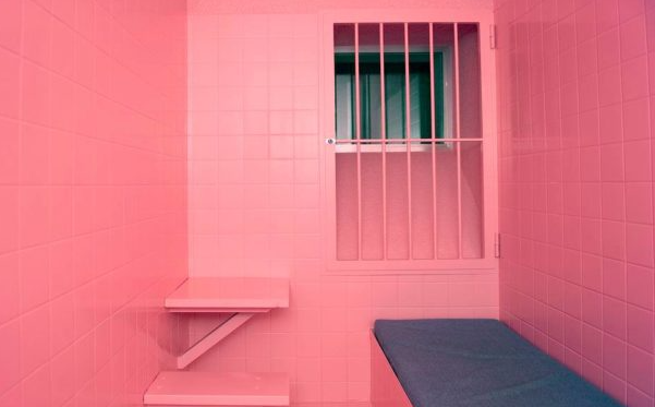
Baker-Miller pink has a curious nickname: “drunk tank pink”. It received this nickname after many prisons painted their holding cells in this color in efforts to calm folks down and reduce aggression (Genschow et al 2014). This decoration choice was not mere coincidence though – it was the result of years of work studying the color’s effect on several physiological measures. Beginning in the 1960’s, Alexander Schauss began investigating practical applications of Baker-Miller pink. It had previously been theorized by Swiss psychiatrist Max Lüscher that color preferences were informative about one’s personalities and could influence one’s psychology and physiology by inducing different internal states [Pellegrini 1981]. In neuroscience and psychology, internal states are generally thought of as states wherein the body and brain are differentially tuned to specific needs and stimuli – this tuning influences behavior, physiological function, and neural activity [Flavell et al 2022]. Schauss began his color journey by inferring that if state could influence perception of color, it was necessary to also investigate if color could influence state. Thus, he ran with the idea that pink was a calming color, a theory also generated by Lüscher.
Schauss performed a test dubbed “the Kinesoid experiment,” wherein he tested the effect of different colors on muscle strength. In one of Schauss’ studies on the matter, participants were instructed to squeeze a hand dynamometer (Fig. 1) with their maximum strength while being presented with exposure to a color. Interestingly, strength scores were seen to be reduced in trials where participants were shown the color pink, compared to blue, which acted as a control (Pellegrini 1980). Though this physiological effect was intriguing, they admitted that their stimulus delivery – a large cardboard plate of each color – was not ideal.
Whether the selection of blue as a control was a well-founded decision remains to be seen, since we have no way of knowing if blue would cause any effects of its own. Additionally, if their intention was to present an “opposite” or starkly different color stimulus, they appear to have chosen a color considered “opposite” by societal standards (note the ties to gender stereotypes) but not “opposite” by color theory standards (the color wheel dictates that a shade of green is complementary to pinks).
– thoughts from the NeuWriters
Soon after the initial experiments, Schauss collaborated with two naval officers (surnames Baker and Miller) to paint holding cells for incoming inmates in this particular shade of pink. If a flat cardboard plate was a limiting factor before, they certainly circumvented the issue here – the entire room was painted pink, barring only the floor. Prior to this qualitative experiment, officers reported having significant trouble with aggressive outbursts during intake, making processing paperwork and transportation difficult. After implementing a Baker-Miller pink paint job, however, it was found that 15 minutes of exposure led to a complete reduction of incidents of aggressive behavior during intake; there were zero instances during the 156 days following the inaugural use of the pink cell (Schauss, 1979). Anecdotally, they observed the calm state to persist for about a half hour after exiting the holding cell (Schauss, 1979).
When considering the potential psychological effects of color, it is crucial to acknowledge western societal connotations. Historically, female babies are surrounded with shades of pink and purple and given a certain selection of brightly colored toys, while male children are swathed in blues and greens and given a completely different set of playthings. While this is beginning to change in modern society – which is part of a larger, important conversation about socialization of different genders – it has led to the stereotyped association of pink as a feminine color. Whether this plays a role in the psychological effects recorded by Schauss, Baker, and Miller is unclear. From these experiments to modern marketing and graphic design work, careful selection of colors is closely tied to the emotions and associations we have tied to each shade. Thus, even though your favorite color does not innately tell the world something about your physiological responses to colorful stimuli, perhaps it still can shed some light on how we feel about the colors’ connotations.


You must be logged in to post a comment.