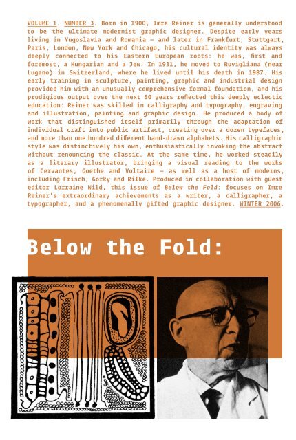
VOLUME 1. NUMBER 3. Born in 1900, Imre Reiner ... - Below the Fold
VOLUME 1. NUMBER 3. Born in 1900, Imre Reiner ... - Below the Fold
VOLUME 1. NUMBER 3. Born in 1900, Imre Reiner ... - Below the Fold

Create successful ePaper yourself
Turn your PDF publications into a flip-book with our unique Google optimized e-Paper software.
<strong>VOLUME</strong> <strong>1.</strong> <strong>NUMBER</strong> <strong>3.</strong> <strong>Born</strong> <strong>in</strong> <strong>1900</strong>, <strong>Imre</strong> Re<strong>in</strong>er is generally understood<br />
to be <strong>the</strong> ultimate modernist graphic designer. Despite early years<br />
liv<strong>in</strong>g <strong>in</strong> Yugoslavia and Romania — and later <strong>in</strong> Frankfurt, Stuttgart,<br />
Paris, London, New York and Chicago, his cultural identity was always<br />
deeply connected to his Eastern European roots: he was, first and<br />
foremost, a Hungarian and a Jew. In 1931, he moved to Ruvigliana (near<br />
Lugano) <strong>in</strong> Switzerland, where he lived until his death <strong>in</strong> 1987. His<br />
early tra<strong>in</strong><strong>in</strong>g <strong>in</strong> sculpture, pa<strong>in</strong>t<strong>in</strong>g, graphic and <strong>in</strong>dustrial design<br />
provided him with an unusually comprehensive formal foundation, and his<br />
prodigious output over <strong>the</strong> next 50 years reflected this deeply eclectic<br />
education: Re<strong>in</strong>er was skilled <strong>in</strong> calligraphy and typography, engrav<strong>in</strong>g<br />
and illustration, pa<strong>in</strong>t<strong>in</strong>g and graphic design. He produced a body of<br />
work that dist<strong>in</strong>guished itself primarily through <strong>the</strong> adaptation of<br />
<strong>in</strong>dividual craft <strong>in</strong>to public artifact, creat<strong>in</strong>g over a dozen typefaces,<br />
and more than one hundred different hand-drawn alphabets. His calligraphic<br />
style was dist<strong>in</strong>ctively his own, enthusiastically <strong>in</strong>vok<strong>in</strong>g <strong>the</strong> abstract<br />
without renounc<strong>in</strong>g <strong>the</strong> classic. At <strong>the</strong> same time, he worked steadily<br />
as a literary illustrator, br<strong>in</strong>g<strong>in</strong>g a visual read<strong>in</strong>g to <strong>the</strong> works<br />
of Cervantes, Goe<strong>the</strong> and Voltaire — as well as a host of moderns,<br />
<strong>in</strong>clud<strong>in</strong>g Frisch, Gorky and Rilke. Produced <strong>in</strong> collaboration with guest<br />
editor Lorra<strong>in</strong>e Wild, this issue of <strong>Below</strong> <strong>the</strong> <strong>Fold</strong>: focuses on <strong>Imre</strong><br />
Re<strong>in</strong>er’s extraord<strong>in</strong>ary achievements as a writer, a calligrapher, a<br />
typographer, and a phenomenally gifted graphic designer. WINTER 2006.
<strong>Imre</strong> Re<strong>in</strong>er: Modern Craftsman<br />
emorable design (<strong>the</strong> k<strong>in</strong>d that persists <strong>in</strong> art annuals and<br />
design compilations) long surpasses <strong>the</strong> actual lifespan of its<br />
creator, usually by virtue of a few endlessly reproduced images.<br />
Such m<strong>in</strong>imal records highlight <strong>the</strong> brilliance yet omit some of<br />
<strong>the</strong> more real, idiosyncratic details that tell us what a certa<strong>in</strong><br />
designer did, for example, on a day-to-day<br />
basis — <strong>the</strong> k<strong>in</strong>ds of details that l<strong>in</strong>k <strong>the</strong><br />
person to <strong>the</strong> time <strong>in</strong> which <strong>the</strong>y lived to<br />
<strong>the</strong> work itself. We are left to draw our own<br />
conclusions, construct<strong>in</strong>g some sort of biographical narrative (and over<br />
time, a social history) from what are often sketchy and unreliable first-<br />
hand sources. How odd, <strong>the</strong>n, to consider <strong>the</strong> case of <strong>Imre</strong> Re<strong>in</strong>er, a Hungarian<br />
designer who was not only prolific, but who generously published his work,<br />
over half a century ago, to a large <strong>in</strong>ternational audience. Odder still,<br />
he is scarcely remembered.<br />
Re<strong>in</strong>er’s most <strong>in</strong>terest<strong>in</strong>g designs do little to correspond to our sense of<br />
design history, to what might be considered <strong>the</strong> über-narrative of <strong>the</strong> period.<br />
Re<strong>in</strong>er lived <strong>in</strong> Switzerland, but was not of it: he was nei<strong>the</strong>r part of Neue<br />
Grafik Design, nor was he associated with Joseph Müller-Brockmann, nor was<br />
he connected to Max Bill or any of a number of peers associated with <strong>the</strong><br />
Kunstgerwerbeshule. Perhaps <strong>the</strong> Swiss contemporary most compatible with<br />
Re<strong>in</strong>er at that time was Walter Herdeg, <strong>the</strong> editor of Graphis, who frequently<br />
published historical examples of early design and <strong>in</strong>cunabula contrasted with<br />
his advocacy of <strong>the</strong>n-contemporary graphic design — work that Herdeg felt pos-<br />
sessed energy and spirit, regardless of any formal or stylistic allegiance to<br />
<strong>the</strong> post-war Swiss Style. This was <strong>the</strong> same strategy that Re<strong>in</strong>er used <strong>in</strong> his<br />
books, mix<strong>in</strong>g historical material with his own work to gently m<strong>in</strong>imize <strong>the</strong><br />
contextual difference between <strong>the</strong> old and <strong>the</strong> new. (Re<strong>in</strong>er’s books were typi-<br />
cally covered <strong>in</strong> craft paper, <strong>the</strong> text pr<strong>in</strong>ted <strong>in</strong> pla<strong>in</strong> black and accented <strong>in</strong><br />
his signature Ch<strong>in</strong>ese-lacquer red — such bold graphic presentation bely<strong>in</strong>g<br />
<strong>the</strong> complexity of <strong>the</strong> work.) Herdeg and Re<strong>in</strong>er both used history to con-<br />
nect <strong>the</strong> spirit of <strong>the</strong> new with someth<strong>in</strong>g unique that <strong>the</strong>y saw <strong>in</strong> <strong>the</strong> (often<br />
anonymous) work of <strong>the</strong> past. As an editorial strategy, this impulse to “mix<br />
it up,” — to use history as a counterpo<strong>in</strong>t to <strong>the</strong> contemporary — produced<br />
a lively argument <strong>in</strong> support of graphic design as a field with substantive<br />
cultural cont<strong>in</strong>uity. As a design strategy, however, it was decidedly less<br />
accessible than, say, <strong>the</strong> modernist work of Re<strong>in</strong>er’s Swiss colleagues, those<br />
predisposed toward <strong>the</strong> pure, rational, reduced form that came to epitomize<br />
post-war visual culture.<br />
In <strong>the</strong> end, <strong>the</strong> aspect of Re<strong>in</strong>er’s work that is impossible to mimic is<br />
his hand; his calligraphic work, pursued for its own sake, as well as <strong>the</strong><br />
gestural form underly<strong>in</strong>g his letterforms and font design, demonstrates a<br />
profound level of craft, a considerable depth of knowledge and artistic<br />
<strong>in</strong>st<strong>in</strong>ct. The evidence is <strong>the</strong>re, too, <strong>in</strong> his obsessively creative extrapola-<br />
tion of new ideas for <strong>the</strong> 26 old ones: Letters, <strong>in</strong> <strong>the</strong>ir boundless variety of<br />
form, are an <strong>in</strong>exhaustible topic. Not only are <strong>the</strong>y mirrors of <strong>the</strong>ir times,<br />
<strong>the</strong>y lead <strong>the</strong> student <strong>in</strong>to <strong>the</strong> fairest lands of controlled ardor, where primal forms and<br />
enigmas meet; where that which was believed unconquerable shows itself pliant and unresist-<br />
<strong>in</strong>g, ask<strong>in</strong>g noth<strong>in</strong>g of <strong>the</strong> wanderer but patience and understand<strong>in</strong>g of its world. Here, Re<strong>in</strong>er<br />
establishes his rightful place — somewhere between <strong>the</strong> larger history of visual communica-<br />
tion and <strong>the</strong> specific context which he himself occupied — as an émigré whose true home was<br />
a world fashioned <strong>in</strong> his draw<strong>in</strong>gs, through his read<strong>in</strong>g, an imag<strong>in</strong>ed doma<strong>in</strong> connect<strong>in</strong>g <strong>the</strong><br />
private language of <strong>the</strong> artist’s hand to <strong>the</strong> public realm of graphic design. A seeker of bal-<br />
ance, his words reveal an attempt to reconcile traumatic history with an acknowledgement that<br />
everyth<strong>in</strong>g was now different. And how could such difference be rationalized through one, even<br />
International Style? Even <strong>in</strong> our short life we often have to realize that rigid devotion to<br />
one s<strong>in</strong>gle dogma must spell, not development, but sterility.<br />
He may have been operat<strong>in</strong>g from a different standpo<strong>in</strong>t, one that allowed for a more di-<br />
versified practice — from <strong>the</strong> most personal and experimental gestures to <strong>the</strong> most graceful<br />
revisions of classicism — that susta<strong>in</strong>ed his unique and <strong>in</strong>dependent identity as a designer.<br />
Despite <strong>the</strong> vagaries of public commissions, he somehow crafted work that was his own, pre-<br />
figur<strong>in</strong>g an era <strong>in</strong> which so many designers would seek work, as so many of us do today, that<br />
somehow transcends <strong>the</strong> limits of <strong>the</strong> trade. To look at Re<strong>in</strong>er today is to appreciate that<br />
knowledge can emerge from <strong>the</strong> study of history, that a designer can simultaneously embrace<br />
<strong>the</strong> pragmatic and <strong>the</strong> romantic, and that <strong>the</strong> discipl<strong>in</strong>e that susta<strong>in</strong>s a practice must come,<br />
<strong>in</strong> <strong>the</strong> end, from <strong>the</strong> heart. As for <strong>the</strong> rest, Re<strong>in</strong>er said only this: I am content to leave my<br />
handiwork to time.<br />
— Lorra<strong>in</strong>e Wild<br />
2<br />
A piece of Re<strong>in</strong>er’s typography I’ve<br />
always admired but never understood:<br />
an advertisement for a pr<strong>in</strong>ter,<br />
composed simultaneously on a center<br />
axis, and not. A capital Z hangs<br />
to <strong>the</strong> left of <strong>the</strong> center, allud<strong>in</strong>g<br />
to a traditional label; <strong>in</strong> <strong>the</strong> box<br />
are fragments of some older ornament<br />
(currency?) and a few free-float<strong>in</strong>g<br />
l<strong>in</strong>es and dots. Bold copy composed<br />
with<strong>in</strong> delicately float<strong>in</strong>g l<strong>in</strong>es<br />
suggests sophisticated modernist<br />
typography. There are precedents for<br />
experimental 20th century typography<br />
composed with eclectic fonts, such<br />
as early Bauhaus typography or, <strong>in</strong><br />
a more deliberately exuberant manner,<br />
Jan Tschichold’s 1935 Asymmetric<br />
Typography. Re<strong>in</strong>er’s work, cont<strong>in</strong>u<strong>in</strong>g<br />
that <strong>the</strong>me, is somehow both more<br />
sophisticated and more motley,<br />
comb<strong>in</strong><strong>in</strong>g <strong>the</strong> elegance of Bodoni<br />
with Dadaist scraps, with a nod to<br />
vernacular commercial sett<strong>in</strong>gs. The<br />
resultant design is fasc<strong>in</strong>at<strong>in</strong>g but<br />
too ref<strong>in</strong>ed and particular to have<br />
<strong>in</strong>fluence. Or perhaps its just too<br />
tricky to be copied.
Examples of Re<strong>in</strong>er’s calligraphic letterforms<br />
5
Calligraphic alphabets (left page) and Re<strong>in</strong>er’s letter<strong>in</strong>g for book covers and title pages<br />
7
Corv<strong>in</strong>us, Bauersche Giesserei, Frankfurt a. M., 1932-35 (1928-30). [Corv<strong>in</strong>us Skyl<strong>in</strong>e, Ann Pomeroy, 1992]<br />
Gotika, Bauersche Giesserei, Frankfurt a. M., 1933 (1931). [Lea<strong>the</strong>r, Patrick Griff<strong>in</strong>, 2005]<br />
Symphonie (Stradivarius), Bauersche Giesserei, Frankfurt a. M., 1938 (1932-35).<br />
Matura, Monotype Corporation, London, 1938 (1936-37).<br />
Re<strong>in</strong>er Script, Lettergieterij Amsterdam, Amsterdam 1950 (1938-47).<br />
Mustang, D. Stempel AG, Frankfurt a. M., 1956 (1954). [Hunter, Patrick Griff<strong>in</strong>, 2005]<br />
Bazaar, D. Stempel AG, Frankfurt a. M., 1956 (1954). [Boondock, Patrick Griff<strong>in</strong>, 2005]<br />
London Script, Stephenson Blake & Co., Sheffield, 1957 (1955). [Almanac, Phil Rutter & Rebecca Alaccari, 2004]<br />
Mercurius, Monotype Corporation, London, 1957 (1955).<br />
Pepita, Monotype Corporation, London, 1959 (1955-56).<br />
Meridian, Gebr. Kl<strong>in</strong>gspor, Offenbach a. M., published 1929 (sketched 1927).<br />
Floride, Deberny et Peignot, Paris, 1939 (1937).<br />
Figaro, Monotype Corporation, London, 1940 (1937-38).<br />
Contact, Deberny et Peignot, Paris, 1953 (1951-52).<br />
Re<strong>in</strong>er Black, H. Berthold AG Berl<strong>in</strong>, 1955 (1953).
TK alligraphic alphabets (left page) and Re<strong>in</strong>er’s letter<strong>in</strong>g for book covers and title pages<br />
9
“Letter<strong>in</strong>g and all its ample and manifold forms is a topic<br />
that never can be exhausted. Writ<strong>in</strong>g is not only a mirror of<br />
<strong>the</strong> character of <strong>the</strong> writer and of <strong>the</strong> period <strong>in</strong> which it was<br />
written, it leads anyone study<strong>in</strong>g it <strong>in</strong>to <strong>the</strong> glamorous regions<br />
of bridled passions, where primeval forms and ancient riddles<br />
meet, where what is o<strong>the</strong>rwise uncontrollable shows itself<br />
docile and will<strong>in</strong>g, demand<strong>in</strong>g no more of <strong>the</strong> observer than<br />
patience and sympathy with its own world.”<br />
<strong>Imre</strong> Re<strong>in</strong>er, Creative Desire, 1949.<br />
10
Ornamental symbols and flourishes<br />
11
13<br />
Examples of Re<strong>in</strong>er’s illustrative letterforms
17<br />
Examples of illustrative words and logotypes.
<strong>Imre</strong> Re<strong>in</strong>er, c. 1948.<br />
Monogram for <strong>Imre</strong> & Hedwig Re<strong>in</strong>er.<br />
Please do not put me <strong>in</strong> <strong>the</strong> Register of swiss artists, for I am not Swiss<br />
and, <strong>the</strong> Swiss artists would be very offended to hear or see my name among<br />
<strong>the</strong>irs, or have my work mentioned under <strong>the</strong> flag of Switzerland. I was a<br />
Hungarian citizen, dur<strong>in</strong>g <strong>the</strong> Hungarian Nazi Regime I have lost my<br />
citizenship which, I had back now temporarily only. I am ei<strong>the</strong>r Hungarian,<br />
nor Swiss, I am – quasi – a nobody. And I am positively not a swiss, for<br />
<strong>the</strong> sake of all Switzerland!<br />
From a letter to George Wittenborn, October 9, 1946.<br />
Chronology<br />
<strong>1900</strong><br />
<strong>Born</strong> August 18 <strong>in</strong> Vrsac, Yugoslavia.<br />
Fa<strong>the</strong>r was a gold, silver and stone engraver<br />
and sculptor.<br />
1904<br />
Family moves to Timisoara, Romania, birthplace<br />
of his mo<strong>the</strong>r.<br />
1904 – 1913<br />
Elementary and middle school, where he studies<br />
sculpture, pa<strong>in</strong>t<strong>in</strong>g and draw<strong>in</strong>g.<br />
1914 – 1915<br />
As World War I beg<strong>in</strong>s, leaves home to live<br />
<strong>in</strong>dependently.<br />
Death of both parents.<br />
1915 – 1918<br />
Spends four years <strong>in</strong> Zlatna, a prov<strong>in</strong>cial town<br />
<strong>in</strong> Transylvania, Romania.<br />
With war <strong>in</strong> <strong>the</strong> background, attends <strong>the</strong><br />
national sculpture school on a scholarship.<br />
1918 – 1920<br />
Moves to Budapest, Hungary; attends <strong>the</strong><br />
National Art School to study sculpture.<br />
In <strong>the</strong> chaotic aftermath of <strong>the</strong> war, leaves<br />
Budapest.<br />
1920<br />
Moves to Frankfurt and attends <strong>the</strong><br />
Kunstgewerbeschule. Shifts from sculpture<br />
to focus on pa<strong>in</strong>t<strong>in</strong>g and graphic arts.<br />
1921 – 1923<br />
Moves to Stuttgart and attends <strong>the</strong> Akademie<br />
der Bildenden Künste. Studies with Ernst<br />
Schneidler, a professor of <strong>the</strong> book arts.<br />
Meets Hedwig Bauer, an acqua<strong>in</strong>tance of a<br />
classmate.<br />
First exhibition: Galerie Schaller, Stuttgart.<br />
First published illustrations: Maxim Gorky’s<br />
Die Geschichte e<strong>in</strong>es Verbrechens.<br />
Meet<strong>in</strong>gs with Paul Klee <strong>in</strong> Weimar.<br />
1923 – 1925<br />
Moves to New York, <strong>the</strong>n Chicago, where he works<br />
as a laborer <strong>in</strong> a factory.<br />
1925 – 1927<br />
Returns to Europe.<br />
Cont<strong>in</strong>ues studies at <strong>the</strong> Akademie der Bildenden<br />
Künste <strong>in</strong> Stuttgart with Ernst Schneidler.<br />
In addition to pa<strong>in</strong>t<strong>in</strong>g, studies graphic and<br />
<strong>in</strong>dustrial design.<br />
Sketches automobile bodies for Mercedes.<br />
Study trips to Paris and Brittany. Encounters<br />
Chard<strong>in</strong> and Pouss<strong>in</strong> <strong>in</strong> <strong>the</strong> Louvre.<br />
Study trip to Tuscany (Florence and Settignano).<br />
First stay <strong>in</strong> Ruvigliana, near Lugano,<br />
Switzerland.<br />
1928 – 1929<br />
Cont<strong>in</strong>ues to work <strong>in</strong> Stuttgart.<br />
First drafts of typography for Meridian<br />
and Corv<strong>in</strong>us.<br />
Summer stay at Westkapelle, Holland.<br />
1930<br />
Moves from Stuttgart to Paris.<br />
Exhibition at Galerie Zak, Paris.<br />
1931<br />
Marries Hedwig Bauer <strong>in</strong> Paris. Moves to<br />
Ruvigliana, Switzerland <strong>in</strong>to <strong>the</strong> Villa Sassa.<br />
Inspired by Loire Valley landscapes, a period<br />
of pa<strong>in</strong>t<strong>in</strong>g.<br />
First drafts of typography for Gotika.<br />
1932 – 1935<br />
Vacations <strong>in</strong> England.<br />
First drafts of typography for Symphonia.<br />
1936 – 1939<br />
Numerous visits to London as advisor to <strong>the</strong><br />
Monotype Corporation.<br />
First drafts of typography for Matura, Floride,<br />
Figaro, and Re<strong>in</strong>er Script.<br />
1941<br />
Exhibition at Buchantiquariat Art Ancien,<br />
Zurich.<br />
Illustrations for Miguel de Cervantes’ Szenen<br />
aus Don Quixote.<br />
1942<br />
Moves to Basel as artistic director of <strong>the</strong><br />
publish<strong>in</strong>g house Benno Schwabe; designs <strong>the</strong><br />
<strong>in</strong>ternal magaz<strong>in</strong>e Offic<strong>in</strong>a.<br />
Illustrations for Novalis’ Hymmen an die Nacht.<br />
Illustrations for Voltaire’s La Pr<strong>in</strong>cesse<br />
de Babilone.<br />
Publishes Initialen von <strong>Imre</strong> Re<strong>in</strong>er.<br />
1943<br />
Illustrations for Goe<strong>the</strong>’s Novelle.<br />
Illustrations for Ra<strong>in</strong>er Marie Rilke’s Zwei<br />
Gedichte.<br />
18<br />
1944<br />
Illustrations for Hugo von Hofmannsthal’s<br />
Andreas oder Die Vere<strong>in</strong>igten.<br />
Publishes Typo-Graphik: Studien und Veruche.<br />
1945<br />
Illustrations for Charles Dickens’<br />
Die Geschichte des Handlungreisenden.<br />
Publishes Das Buch der Werkzeichen.<br />
1946<br />
Publishes Grafika.<br />
1947<br />
Publishes Alphabets by <strong>Imre</strong> and Hedwig Re<strong>in</strong>er:<br />
A Manual of Alphabets.<br />
Publishes Monogramme.<br />
Publishes Holzschnitt — Holzstich.<br />
1948<br />
Publishes Schrift im Buch.<br />
Exhibition at Musée Royal des Beaux-Arts,<br />
Antwerp.<br />
1949<br />
Publishes Wunsch und Gestaltung.<br />
Exhibition at <strong>the</strong> Pr<strong>in</strong>t Club, Philadelphia.<br />
Exhibition at Buchhandlung Waldmann, Zurich.<br />
1950<br />
Becomes a Swiss citizen. Works <strong>in</strong> Paris for<br />
UNESCO Department of Cultural Activities,<br />
where he designs International Art Review.<br />
Publishes Typo-Graphik II.<br />
Exhibition at Galerie A. Loewy, Paris.<br />
1951 – 1956<br />
First drafts of typography for Contact, Re<strong>in</strong>er<br />
Black, Mustang, Bazaar, London Script,<br />
Mercurius and Pepita.<br />
1954<br />
Exhibition at Museu de Arte, São Paulo.<br />
1956<br />
Exhibition at Apprentice House, Chicago.<br />
1962<br />
Honored at “Accademia Fiorent<strong>in</strong>a delle Arti<br />
del Disegno.”<br />
Exhibition at Civic Center, San Francisco.<br />
1964<br />
Honored at “Biennale Bianco e Nero” <strong>in</strong> Lugano.<br />
Illustrations for Adelbert von Chamisso’s Peter<br />
Schlemihls Wundersame Geschichte.<br />
Publication of A Section of Wood Engrav<strong>in</strong>gs by<br />
<strong>Imre</strong> Re<strong>in</strong>er.<br />
1965<br />
Illustrations for Robert Walser’s E<strong>in</strong>e Ohrfeige<br />
und Sonstiges.<br />
1968<br />
Illustrations for The Poems of John Donne.<br />
1969<br />
Exhibition at Galleria Mosaico <strong>in</strong> Chiasso,<br />
Switzerland.<br />
1970<br />
Exhibition at Square Gallery, Milan.<br />
1974<br />
Large retrospective exhibition at <strong>the</strong><br />
Malpensata, Lugano.<br />
1975<br />
Illustrations for Die Ziffernbilder<br />
and exhibition <strong>in</strong> Stuttgart.<br />
Publication of <strong>Imre</strong> Re<strong>in</strong>er by Mogens<br />
Greve-Olsen.<br />
1976<br />
Publication of Samtale i Weimar, Sommeren 192<strong>3.</strong><br />
1979<br />
Death of wife, Hedwig Bauer.<br />
1982<br />
End of travel and artistic activities for<br />
health reasons.<br />
1983<br />
Exhibition at <strong>the</strong> Royal Institute of British<br />
Architects, London.<br />
1984<br />
Illustrations for Primo Levi’s L’ultimo Natale<br />
di guerra.<br />
1987<br />
Dies August 21 <strong>in</strong> Lugano, Switzerland.<br />
1990<br />
Publication of Blumen und Fruchte <strong>in</strong><br />
Holzstichen von <strong>Imre</strong> Re<strong>in</strong>er.<br />
Publication of Tre Xilografi: Ugo Cleis,<br />
Aldo Patocchi, <strong>Imre</strong> Re<strong>in</strong>er.
Bibliography<br />
Works by <strong>Imre</strong> Re<strong>in</strong>er<br />
Alphabets by <strong>Imre</strong> and Hedwig Re<strong>in</strong>er: A Manual of Alphabets. St. Gallen: Zollikofer & Company, 1947.<br />
Creative Desire. English version by Cecil Clifferet Palmer. St. Gallen: Zollikofer & Company, 1949.<br />
Das Buch der Werkzeichen. St. Gallen: Verlag Zollikofer & Company, 1945.<br />
Grafika: Modern Design for Advertis<strong>in</strong>g and Pr<strong>in</strong>t<strong>in</strong>g. New York: Paul A. Struck, 1947. [Edition of<br />
1000 copies.]<br />
Initialen von <strong>Imre</strong> Re<strong>in</strong>er. Introduction by Hermann Kienzle. Basel: Benno Schwabe & Company 1942.<br />
Letter<strong>in</strong>g <strong>in</strong> Book Art. St. Gallen: Zollikofer & Company, 1948.<br />
Modern and Historical Typography: An Illustrated Guide. St. Gallen: Zollikofer & Company, 1946.<br />
Modern and Historical Typography: Second Volume. St. Gallen: Zollikofer & Company, 1950.<br />
Monograms. St. Gallen: Zollikofer & Company, 1947.<br />
“The Ornamental Letter<strong>in</strong>g of <strong>Imre</strong> Re<strong>in</strong>er.” Spencer, Herbert, editor. Typographica, Orig<strong>in</strong>al Series :<br />
Number 2. London: Lund Humphries, 1950.<br />
Samtale i Weimar, sommeren 192<strong>3.</strong> Essay by Mogens Greve-Olson. Kobenhavn: Ruvigliana, Roskilde. 1976.<br />
[Re<strong>in</strong>er’s conversations with Paul Klee. Limited edition with engraved frontispiece.]<br />
Typo-Graphik II: Studien und Versuche. St. Gallen: Verlag Zollikofer & Company, 1950. [German edition<br />
of Modern and Historical Typography: Second Volume.]<br />
Typo-Graphisme: Etudes et Essais. St. Gallen: Editions Zollikofer & Cie, 1948. [French edition of<br />
Modern and Historical Typography.]<br />
“Visual Qualities of Corv<strong>in</strong>us and Symphony.” Rudge, William Edw<strong>in</strong>, editor. Pr<strong>in</strong>t: A Quarterly Journal<br />
of <strong>the</strong> Graphic Arts, Volume VI : Number <strong>1.</strong> Woodstock, Vermont: Pr<strong>in</strong>t, 1948.<br />
Woodcut/Wood Engrav<strong>in</strong>g: A Contribution to <strong>the</strong> History of <strong>the</strong> Art. London: Publix Publish<strong>in</strong>g Company<br />
& St. Gall: Zollikofer & Company, 1947.<br />
Works About <strong>Imre</strong> Re<strong>in</strong>er<br />
Gasser, Manuel. “<strong>Imre</strong> Re<strong>in</strong>er.” Amstutz, Walter and Walter Herdeg, editors. Graphis, Volume 2 : Number<br />
1<strong>3.</strong> Zurich: Graphis Press, January/February 1946. [Cover illustration by Re<strong>in</strong>er.]<br />
Greve-Olsen, Mogens. <strong>Imre</strong> Re<strong>in</strong>er: Skriftkunstner, Typografiker, Forfatter, Maler og grafiker. Frankfurt:<br />
D. Stempel AG, 1975.<br />
<strong>Imre</strong> Re<strong>in</strong>er. Catalogue 24. Chiasso: Galleria Mosaico, 1969. [Exhibition catalogue of etch<strong>in</strong>gs and<br />
pa<strong>in</strong>t<strong>in</strong>gs (12) by Re<strong>in</strong>er.]<br />
Re<strong>in</strong>er, Roland. Blumen und Fruchte <strong>in</strong> Holzstichen von <strong>Imre</strong> Re<strong>in</strong>er: E<strong>in</strong>e chronologische Darstellung.<br />
Bern: Bentali, 1990. [Limited edition, number 138 of 195 copies <strong>in</strong> a slipcase with a limited edition<br />
engraved pr<strong>in</strong>t.]<br />
A Selection of Wood Engrav<strong>in</strong>gs by <strong>Imre</strong> Re<strong>in</strong>er. With an <strong>in</strong>troductory biography by Abel Pokorny and<br />
appreciations by Eleanor F. Ste<strong>in</strong>er-Prag and Paul Standard. Chicago: Apprentice House, 1964. [Edition<br />
of 1000 copies: one <strong>in</strong> wrappers and one <strong>in</strong> boards.]<br />
Society of Typographic Arts. <strong>Imre</strong> Re<strong>in</strong>er. English translation by Tom Laufer. St. Gallen: Zollikofer &<br />
Company, 1954.<br />
Terrapon, Michel, editor. Tre Xilografi: Ugo Cleis, Aldo Patocchi, <strong>Imre</strong> Re<strong>in</strong>er. Mendrisio, Switzerland:<br />
Museo d’arte Mendrisio, 1990. [Engrav<strong>in</strong>gs and pa<strong>in</strong>t<strong>in</strong>gs by Re<strong>in</strong>er; with an essay by Michele Re<strong>in</strong>er.]<br />
Willberg, Hans Peter. Die Ziffernbilder. Stuttgart: Fachhochschule fur Druck Stuttgart, 1975.<br />
Typography by <strong>Imre</strong> Re<strong>in</strong>er<br />
Corv<strong>in</strong>us. New York: Bauer Type Foundry, 1935. [Portfolio and pamphlet: typographic specimens and<br />
pr<strong>in</strong>t<strong>in</strong>g samples (23).<br />
Jost, He<strong>in</strong>rich. Bauer Beton. New York: Bauer Type Foundry, n.d. [Pamphlet: Design of this typographic<br />
specimen by Re<strong>in</strong>er.]<br />
Re<strong>in</strong>er Script. New York: Typfoundry Amsterdam, n.d. [Pamphlet: typographic specimen.]<br />
Re<strong>in</strong>er Script. Amsterdam: NV Lettergieterij and N. Tetterode, 1952. [Pamphlet: typographic specimen.]<br />
Spon’s Pocket Book of Alphabets: Revised Edition. London: E. & F. N. Spon, 1956. [Typographic specimen<br />
of Re<strong>in</strong>er’s Stradivarius (Symphonie).]<br />
Symphonie: Nach Entwurfen von <strong>Imre</strong> Re<strong>in</strong>er. Frankfurt: Bauersche Giesserei, n.d. [Pamphlet: typographic<br />
specimen and pr<strong>in</strong>t<strong>in</strong>g samples (19).]<br />
Three ‘Monotype’ Scripts by <strong>Imre</strong> Re<strong>in</strong>er: Matura, Mercurius and Pepíta. London: Monotype Corpration<br />
Limited, n.d. [Pamphlet: typographic specimen.]<br />
Town Topics with Typographic Trimm<strong>in</strong>gs. New York: Bauer Type Foundry, n.d. [Features a typographic<br />
sample of Re<strong>in</strong>er’s Corv<strong>in</strong>us.]<br />
Illustration by <strong>Imre</strong> Re<strong>in</strong>er<br />
Adams, Frederick, Elmer Adler, Alfred Stanford and John W<strong>in</strong>terich, editors. The Colophon: New Series,<br />
A Quarterly for Bookmen, Volume III : Number 2. New York: Colophon, Spr<strong>in</strong>g 1938. [Christmas<br />
illustration by Re<strong>in</strong>er.]<br />
Amstutz, Walter and Walter Herdeg, editors. Graphis, Volume 8 : Number 40. Zurich: Graphis Press,<br />
January 1952. [Cover illustration by Re<strong>in</strong>er.]<br />
Andric, Ivo. Die Geliebte des Veli Pascha: 17 Novellen. Stuttgart: Ste<strong>in</strong>gruben, n.d. [Cover<br />
illustration by Re<strong>in</strong>er.]<br />
Bates, H. E. The Scarlet Sword. Harmondsworth, England: Pengu<strong>in</strong> Books, 1958. [Cover illustration<br />
by Re<strong>in</strong>er.]<br />
Büchner, Georg. Die Nacht. St. Gallen: Zollikofer & Co., 1946. [Typography and illustrated titlepage<br />
vignette by Re<strong>in</strong>er. Includes photograph of an illustration <strong>in</strong>scribed and dated by Re<strong>in</strong>er.]<br />
Cervantes, Miguel de. Szenen aus Don Quixote: Mit e<strong>in</strong>undzwanzig Holzstichen von <strong>Imre</strong> Re<strong>in</strong>er und e<strong>in</strong>em<br />
Nachwort von Hermann Kienzle. Basel: Holbe<strong>in</strong> Verlag 194<strong>1.</strong> [Illustrations (22) by Re<strong>in</strong>er.]<br />
Donne, John. The Poems. Selected, <strong>in</strong>troduced and annotated by Frank Kermode. New York: Heritage Press,<br />
1970. [Wood engrav<strong>in</strong>gs (31) by Re<strong>in</strong>er.]<br />
Forster, E. M. “The Celestial Omnibus.” Dimensions, Volume 3 : Number <strong>1.</strong> Vicksburg, Michigan: Lee Paper<br />
Company, Spr<strong>in</strong>g 1959. [Illustrations (5) by Re<strong>in</strong>er.]<br />
Frisch, Max. Die Ch<strong>in</strong>esische Mauer: E<strong>in</strong>e Farce. Frankfurt: Suhrkamp Verlag, 1955. [Cover illustration<br />
by Re<strong>in</strong>er.]<br />
Gasser, Manuel. “<strong>Imre</strong> Re<strong>in</strong>er: Vier Gemålde und fünf Zeichnungen.” du: Kulturelle Monatsschrift, Volume<br />
22 : Number 25<strong>3.</strong> Zurich: Conzett & Huber, March 1962. [Cover illustration and reproductions of<br />
pa<strong>in</strong>t<strong>in</strong>gs (10) by Re<strong>in</strong>er.]<br />
Goe<strong>the</strong>, Johann Wolfgang von. Das Marchen: Mit 20 Holzstichen von <strong>Imre</strong> Re<strong>in</strong>er. Basel: Petri Press, 1972.<br />
[Limited edition, number 12 of 280 copies, signed by Re<strong>in</strong>er. One of 80 copies with an extra suite<br />
of woodcuts on Japan paper. Clamshell box pattern paper designed by Re<strong>in</strong>er.]<br />
Herdig, Walter, editor. Graphis, Volume 16 : Number 89. Zurich: Graphis Press, May/June 1960. [Cover<br />
illustration by Re<strong>in</strong>er.]<br />
Levi, Primo. L’Ultimo Natale di Guerra. Lugano: Serio Grand<strong>in</strong>i, 1984. [Limited edition, number 405<br />
of 500 copies. Engraved illustrations (6) by Re<strong>in</strong>er.]<br />
Rudge, William Edw<strong>in</strong>, editor. Pr<strong>in</strong>t: A Quarterly Journal of <strong>the</strong> Graphic Arts, Volume V : Number 4.<br />
Woodstock, Vermont: Pr<strong>in</strong>t, 1948. [Cover typography by Re<strong>in</strong>er.]<br />
Chamisso, Adelbert von. Peter Schlemihls Wundersame Geschichte: mit Neun Holzstichen von <strong>Imre</strong> Re<strong>in</strong>er.<br />
Bern: Ars Liborum, Gotthard de Beauclair, 1964. [Limited Edition, number XII of XXXV copies, signed<br />
by Re<strong>in</strong>er. Woodcut engrav<strong>in</strong>gs (9) by Re<strong>in</strong>er. French fold, bound <strong>in</strong> calf. Includes an extra suite of<br />
woodcuts on Japan paper, <strong>in</strong> separate calf portfolio. Slipcase pattern paper designed by Re<strong>in</strong>er.]<br />
Simon, Oliver, editor. Signature: A Quadrimestrial of Typography and Graphic Arts, New Series : 14.<br />
London: Signature, 1952. [Frontispiece: Etch<strong>in</strong>g 1922 by <strong>Imre</strong> Re<strong>in</strong>er.]<br />
Walser, Robert. E<strong>in</strong>e Ohrfeige und Sonstiges: mit Holzstichen von <strong>Imre</strong> Re<strong>in</strong>er. Basel: Schwab & Company,<br />
1965. [Limited edition, number 24 of 100 copies, signed by Re<strong>in</strong>er. Wood engrav<strong>in</strong>gs (15) by Re<strong>in</strong>er<br />
and a separate signed pr<strong>in</strong>t of <strong>the</strong> title illustration on Japan paper.]<br />
O<strong>the</strong>r Materials by <strong>Imre</strong> Re<strong>in</strong>er<br />
Autograph Material 1946–48. Ten s<strong>in</strong>gle-page signed autographed letters to George Wittenborn (publisher)<br />
concern<strong>in</strong>g books and o<strong>the</strong>r material sent to him for consideration: Seven letters <strong>in</strong> English, three<br />
letters <strong>in</strong> German. Includes one signed postcard; four entry forms for books submitted for an AIGA<br />
exhibition at <strong>the</strong> Pierpont Morgan Library <strong>in</strong> 1946; and a few pieces of publisher’s promotion for books<br />
illustrated by Re<strong>in</strong>er.<br />
19
W<strong>in</strong>terhouse Institute<br />
PO Box 159<br />
Falls Village, CT<br />
06031<br />
Paper for this publication<br />
generously provided by<br />
Smart Papers. Pr<strong>in</strong>ted on<br />
Carnival Ice Vellum Text.<br />
Visit smartpapers.com.<br />
<strong>Below</strong> <strong>the</strong> <strong>Fold</strong>:<br />
is an occasional journal from<br />
<strong>the</strong> W<strong>in</strong>terhouse Institute.<br />
Design:<br />
W<strong>in</strong>terhouse<br />
Creative Direction:<br />
William Drenttel<br />
Jessica Helfand<br />
Lorra<strong>in</strong>e Wild<br />
Geoff Halber<br />
Elizabeth Law<br />
Sue Nguyen<br />
Anzel<strong>in</strong>a Okarmus<br />
Typography:<br />
Text composed <strong>in</strong> Fedra Mono<br />
designed by Peter Bilak<br />
of Typo<strong>the</strong>que, The Hague,<br />
The Ne<strong>the</strong>rlands.<br />
Correspondence:<br />
<strong>Below</strong> <strong>the</strong> <strong>Fold</strong>:<br />
W<strong>in</strong>terhouse Institute<br />
PO Box 159<br />
Falls Village, CT 06031<br />
Email: editor@w<strong>in</strong>terhouse.com<br />
Website:<br />
below<strong>the</strong>fold.org<br />
Subscriptions:<br />
To subscribe visit:<br />
below<strong>the</strong>fold.org